Dark Mode Colors: 8 Tips for Readable Dark Themes (Free)
Dark mode colors that work: skip pure black, soften white text, lighten and desaturate accents, and check contrast in both themes with a free checker.
Published · 5 min read
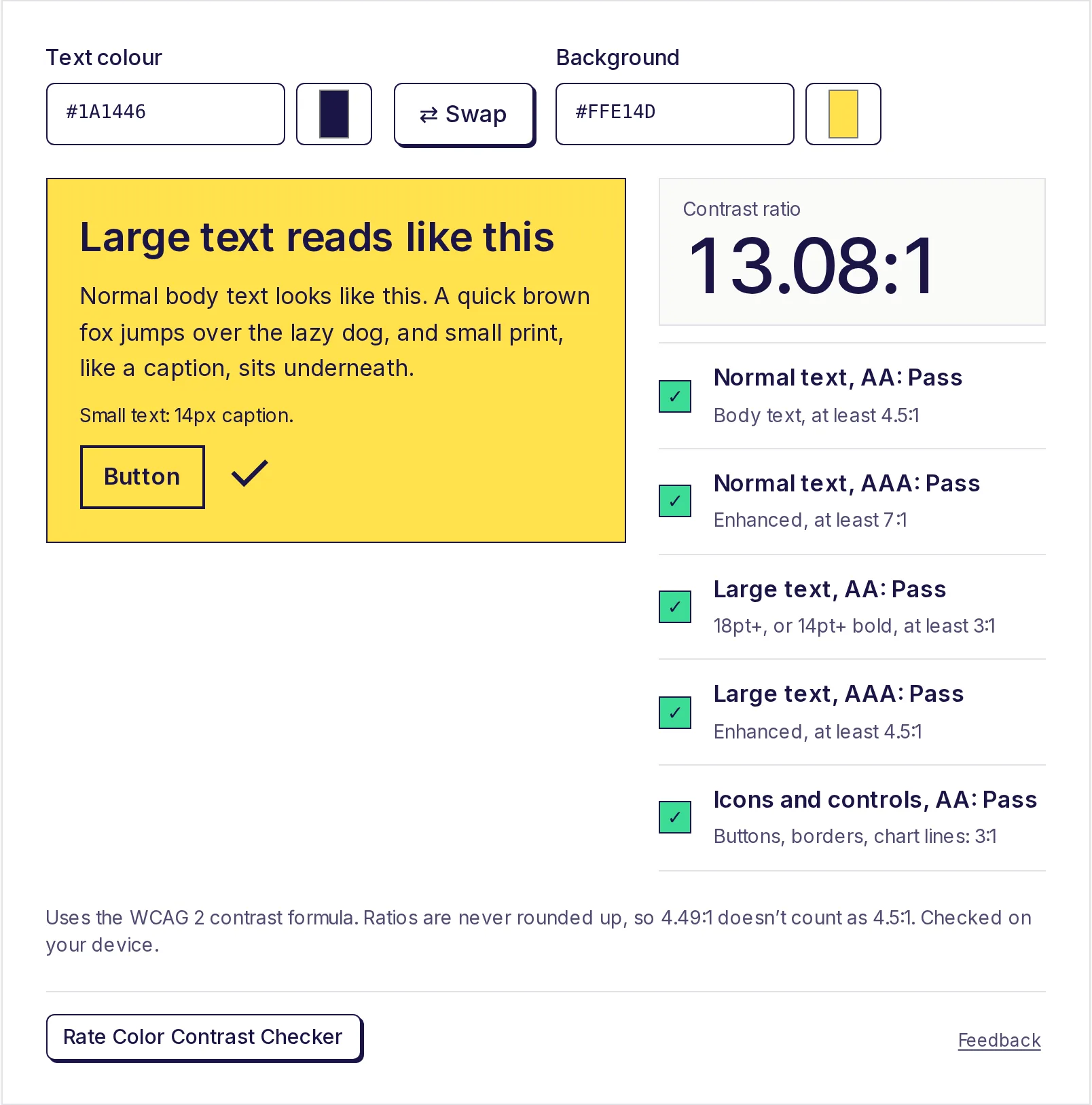
Good dark mode colors start with a dark grey background rather than pure black, off-white text rather than pure white, and accent colours that are lighter and a little less saturated than in your light theme. Most importantly, a colour that passes contrast on white can fail on dark grey, so check every pair in both themes. The free color contrast checker does this in seconds, and its Swap button flips text and background for you.
1. Use dark grey, not pure black
A very dark grey such as #121212 is the usual starting point for dark backgrounds; it's the value Google's Material Design guidance popularised. It has several advantages over #000000:
- You can show elevation: cards and menus can sit on slightly lighter greys (
#1E1E1E,#2B2B2B), which you can't do if the page is already pure black. - It looks softer, with less harsh edges around bright text.
- Subtle dark shadows still read against it, which they can't on pure black.
Pure black has one case for it: on OLED screens, black pixels are switched off, which some people prefer for battery or for a "true black" look. If you offer it, make it an option rather than the default.
2. Soften the text, but not too much
White text on #121212 measures 18.73:1, far above any guideline. Many people find that much contrast glary in long reading, so dark themes often use an off-white or light grey for body text instead:
Text on #121212 |
Ratio | Use it for |
|---|---|---|
#FFFFFF white |
18.73:1 | Headings, short labels |
#E6E6E6 light grey |
15.01:1 | Body text |
#A0A0A0 mid grey |
7.16:1 | Secondary text (still AAA) |
#7A7A7A grey |
4.36:1 | Too faint: fails AA for normal text |
Secondary and "muted" text is where dark themes usually fail. Keep it at 4.5:1 or above. The checker suggests the closest passing grey (here, #7D7D7D is just enough for AA).
3. Lighten your accent colours for dark mode
A brand colour tuned for white backgrounds is usually too dark for a dark one. Take a bright blue, #2F5BFF:
- On white: 5.17:1, passes AA.
- On
#121212: 3.62:1, fails AA for normal text.
The fix is a lighter tint of the same hue. In the free color palette generator, click a colour to see its shade scale from 50 (lightest) to 950 (darkest). For #2F5BFF, the scale's 300 step, #859FFF, measures 7.49:1 on #121212, while the 600 step, #0030DB, measures 8.58:1 on white. Use the darker step in light mode and the lighter one in dark mode, and the brand still looks like itself.
4. Desaturate bright colours
Fully saturated colours (pure reds, electric blues, neon greens) seem to vibrate against a dark background and can be tiring to look at. Lower the saturation a little for dark mode. In the free HEX to RGB converter you can see a colour's HSL value; dropping the S (saturation) by 10 to 20 points and raising the L (lightness) is a quick way to make a dark-mode-friendly version. Then check the result for contrast. If HSL is new to you, HEX vs RGB vs HSL explains it.
5. Check surfaces, not just the page background
Cards, modals, menus and input fields usually use lighter greys than the page. Text that passes on #121212 can lose contrast on #2B2B2B. For example, #E0E0E0 on #2B2B2B is still a comfortable 10.72:1, but a mid grey that barely passed on the page background may fail on a raised card. Check text against every surface colour you use.
6. Don't forget borders, icons and focus rings
Interface parts need at least 3:1 against what's next to them (the WCAG level for non-text contrast). In dark themes, subtle borders on inputs and thin icon strokes often disappear. Check:
- Input borders against the surface.
- Icons against their background.
- Focus outlines against both the element and the page.
- Chart lines and legend markers.
7. Check both themes for every pair
The safest workflow is to keep a small table of colour pairs and test each one twice:
- Open the free color contrast checker.
- Enter the light-theme text and background. Note the ratio.
- Enter the dark-theme pair. Note the ratio.
- Use Swap to quickly test the reverse (for example, a coloured button with white text in one theme and coloured text on dark in the other).
- If anything is under 4.5:1 for text (or 3:1 for large text and controls), click a suggestion under Closest colours that pass.
8. Keep semantic colours readable
Red for errors, green for success, amber for warnings: these need dark-mode versions too, and a dark red that works on white is often unreadable on dark grey. Lighten each one, check it, and add an icon or label so colour isn't the only signal.
Build and check your dark mode colours
Make your light and dark palettes in the free color palette generator, export them as CSS variables, and run every pair through the free color contrast checker. Both tools run on your device, with no sign-up. For the thresholds themselves, see how to check colour contrast for accessibility.
Frequently asked questions
- What is the best background colour for dark mode?
- A very dark grey such as #121212 is the common choice. It's easier on the eyes than pure black and lets raised surfaces use slightly lighter greys.
- Should dark mode text be pure white?
- Not necessarily. Pure white on very dark grey is extremely high contrast; many designs use an off-white like #E6E6E6 for body text and keep pure white for headings.
- Why does my brand colour fail contrast in dark mode?
- Most brand colours are tuned for white backgrounds. Use a lighter tint of the same hue in dark mode and check it again.
- Does dark mode need the same contrast ratios?
- Yes. WCAG asks for the same 4.5:1 for normal text and 3:1 for large text and controls in any theme.
- Is pure black better for OLED screens?
- Black pixels are switched off on OLED screens, so some people prefer it. It can look harsh with bright text, so many apps offer it as an option rather than the default.
Color tools
Try the Color Contrast Checker
Free, no sign-up, works in your browser. Enter a text colour and a background colour to get the WCAG contrast ratio and pass or fail results for AA and AAA, for normal text, large text and buttons or icons.
Also useful
- Color Palette GeneratorGenerate a five-colour palette with one press of the space bar, lock the colours you like, or build a colour scheme from your own base colour: analogous, complementary, triadic and more. See 11 shades of each colour and export as CSS variables, Tailwind, JSON or HEX.
- HEX to RGB Color ConverterConvert HEX to RGB, or RGB to HEX, as you type: paste a colour code in any format and get HEX, RGB, HSL, HSV and CMYK at once, each with a copy button. Set the opacity for 8-digit HEX and rgba(), and see how readable white or black text is on the colour.