Color Psychology in Marketing: What Holds Up, What Doesn't
Does blue build trust and red make people buy? What colour psychology can and can't tell marketers, why culture matters, and what to test. Free palette tool.
Published · 5 min read
Color psychology is the idea that colours shape how people feel and what they do, such as blue suggesting trust or red creating urgency. Some of it holds up: colours do carry associations, and contrast clearly affects what people notice. But the popular charts that assign one emotion to each colour are far more confident than the evidence. Meanings change with context, culture and the product. Use colour psychology as a starting point, then pick a palette that fits your brand with the free color palette generator and test it on real customers.
The popular version of color psychology
You've probably seen a chart like this:
| Colour | Usual claim |
|---|---|
| Red | Excitement, urgency, appetite |
| Blue | Trust, calm, security |
| Green | Nature, health, money |
| Yellow | Optimism, warmth, attention |
| Orange | Friendly, energetic, affordable |
| Purple | Luxury, creativity |
| Black | Sophistication, power |
| White | Clean, simple |
There's something to it. Banks, insurers and tech companies really do use a lot of blue; organic food brands lean green. But that doesn't prove blue causes trust. It may simply be that blue has become the expected colour for those industries, so it signals "this is a bank" more than "trust me".
What the evidence broadly supports
Research on colour and behaviour is mixed, and individual studies often use small groups, lab settings or a single culture. Still, a few points come up consistently enough to rely on:
- Fit beats meaning. People respond better when a colour seems appropriate to the product and brand personality. A pastel pink works for a bakery and feels odd for a law firm, not because pink is "good" or "bad", but because of fit.
- Associations are learned. Most colour meanings come from experience: nature, traditions, earlier brands in the same category. That's why they vary by culture and change over time.
- Contrast drives attention. Things that differ from their surroundings get noticed. A button stands out because it contrasts with the page, not because its hue has a special power.
- Recognition is real. Consistent colour helps people spot a brand quickly, on a shelf or in a feed. This is one of the most practical benefits of choosing colours carefully.
What's overstated
- "Red buttons convert better." You'll find case studies where a red button beat a green one, and others where green won. One plausible explanation is contrast with that particular page rather than the hue itself; individual case studies can't settle it. A button that blends in tends to lose, whatever its colour.
- Precise statistics. Claims that a large, specific percentage of buying decisions are based on colour alone are widely repeated online, often without a clear source. Treat any very precise number about colour and sales with caution.
- Universal emotions. "Blue is calming" might hold loosely for many people, but personal experience, culture and context override it easily.
Culture changes everything: India and the West
Colour meanings are learned, so they differ across regions. A few well-known contrasts:
| Colour | Common associations in India | Common associations in the West |
|---|---|---|
| Red | Weddings, auspiciousness, celebration, sindoor | Danger, sales, love, urgency |
| White | Purity, peace; also mourning in many Hindu communities | Weddings, cleanliness, minimalism |
| Saffron / orange | Sacred, spiritual, festive | Energy, affordability, Halloween |
| Green | Nature, prosperity, Islam for many Muslims, freshness | Nature, money, health, "go" |
| Yellow / turmeric | Auspicious, haldi ceremonies, spring (Basant Panchami) | Caution, cheerfulness |
| Black | Often avoided for auspicious occasions | Luxury, formality, mourning |
These are broad tendencies, not rules. Associations vary by region, religion, community and generation within each country, and global brands have blurred many of them. A red "SALE" banner reads as urgency in Mumbai too. But if you're designing a wedding invitation, a Diwali offer or a condolence message, local meaning matters more than any chart. For festive design, see our palettes for Holi and Indian weddings.
Context: the same colour, different jobs
Black can feel luxurious on a perfume box and gloomy on a children's toy. Green feels fresh on a salad brand and wrong on a meat counter. Yellow grabs attention on a taxi and looks cheap on a high-end watch if handled badly. Always ask: what does this colour mean for this product, in this market, next to these competitors?
A practical approach for marketers
- Start from brand personality, not a colour chart. Write three words for how you want people to feel.
- Check your category. See what colours competitors use. Matching signals "we belong here"; contrasting helps you stand out. Both are valid choices.
- Build a small palette: one primary, one accent, neutrals. The guide to choosing brand colours walks through it. In the free color palette generator, enter your main colour as the Base colour and try different Harmony options.
- Make the important thing contrast. Give calls to action a colour that's used nowhere else on the page, and check text readability in the free contrast checker. Unreadable text loses customers no matter how "trustworthy" its colour.
- Test with real people. A/B test buttons or banners if you have the traffic, and run the test long enough to mean something. Otherwise, show two versions to a handful of customers and ask what each one makes them think of.
- Stay consistent. Recognition builds over months of using the same colours everywhere.
Describing and naming your colours
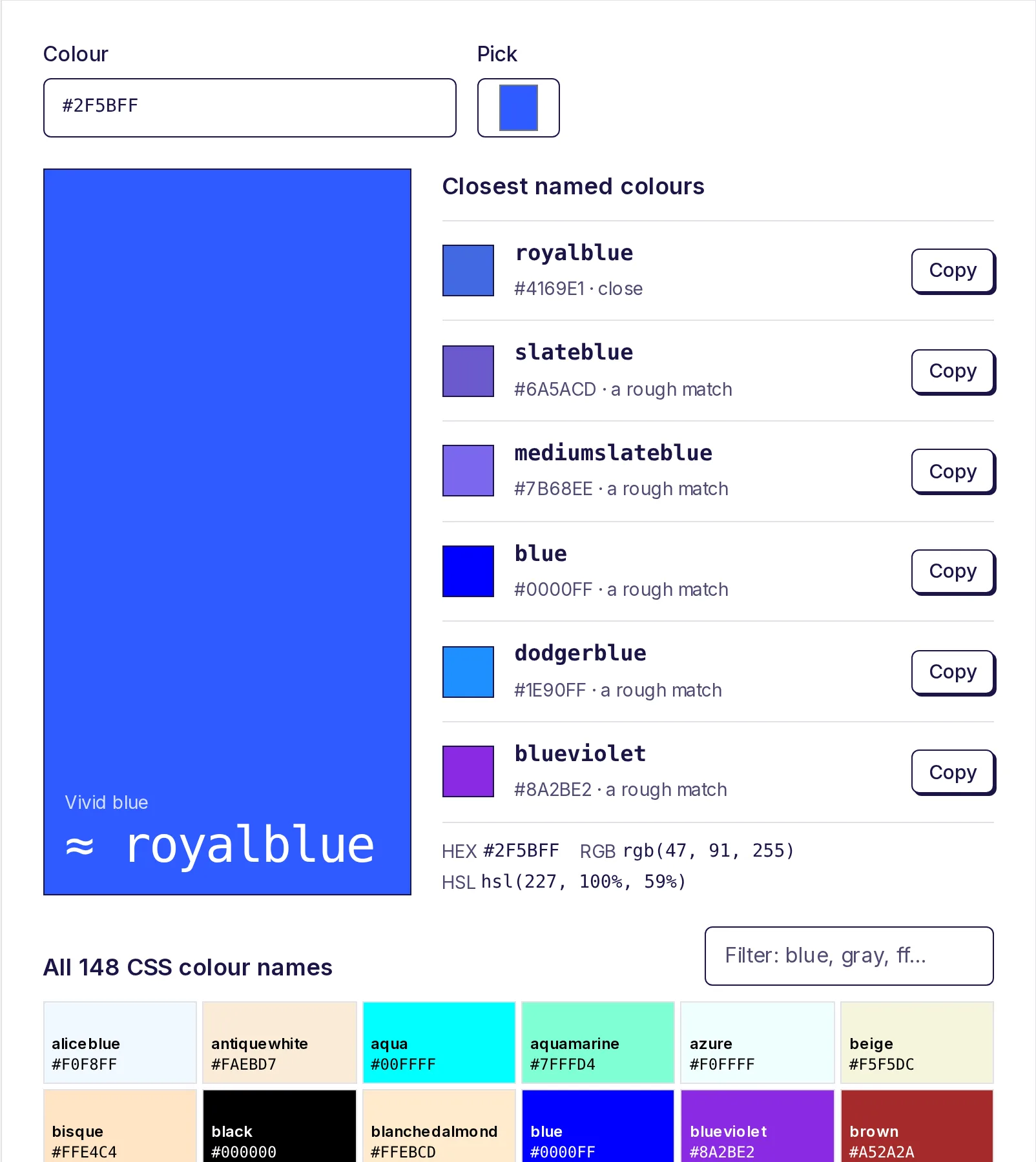
When you brief a designer or write alt text, names help: "tomato red" is clearer than #FF6347. The colour name finder gives the nearest CSS name and a plain description for any HEX code. To borrow colours from a product photo or mood board, use the colour picker from image.
Build a palette that fits
Use colour psychology as a set of hypotheses, not facts. Start with your brand, build a palette in the free color palette generator, check readability, and let your customers' reactions decide.
Frequently asked questions
- Is colour psychology real?
- Partly. Colours carry learned associations, and contrast clearly affects attention. But claims that each colour triggers a specific emotion in everyone are overstated, and effects depend on context and culture.
- What is the best colour for a "Buy" button?
- The one that contrasts most with the rest of your page and isn't used elsewhere. Published tests report different winners on different sites, which suggests contrast matters more than any particular hue.
- Does red mean the same thing in India and the West?
- Not entirely. In India red is strongly linked to weddings, auspiciousness and celebration; in the West it more often signals danger, love or a sale. Both readings exist in both places, depending on context.
- Why do so many banks use blue?
- Partly association and partly convention: once many banks used blue, it became a signal of "financial services". That shows category expectations at work more than any built-in effect of blue.
- How should a small business choose colours?
- Start with your personality and competitors, choose one primary and one accent plus neutrals, check contrast, and get feedback from real customers before printing anything.
Color tools
Try the Color Palette Generator
Free, no sign-up, works in your browser. Generate a five-colour palette with one press of the space bar, lock the colours you like, or build a colour scheme from your own base colour: analogous, complementary, triadic and more.
Also useful
- Color Name FinderPaste a HEX, RGB or HSL code, or pick a colour, and see its closest CSS colour names, nearest first, with a plain description like "dark, vivid blue". Browse and filter all 148 named colours, and copy any name straight into your CSS.
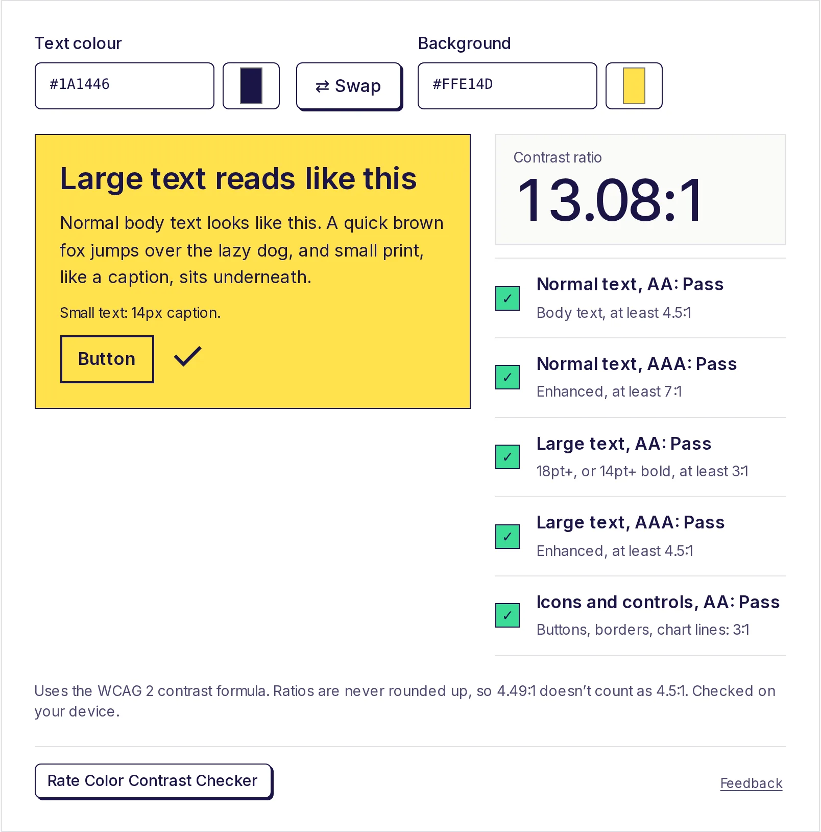
- Color Contrast CheckerEnter a text colour and a background colour to get the WCAG contrast ratio and pass or fail results for AA and AAA, for normal text, large text and buttons or icons. If it fails, click the closest colour that passes.
- Color Palette from ImageGet the main colours of a photo, logo or screenshot as HEX codes, with how much of the image each one covers. Choose 2 to 12 colours, click the image to pick a colour from any spot, and copy the palette as HEX, CSS variables or JSON. Your image stays on your device.