How to Choose Brand Colors: 9 Steps with Free Tools
Pick a primary colour, an accent and neutrals, test contrast, and write it all down. A practical brand palette process for small businesses, with free tools.
Published · 5 min read
To choose brand colors, start with one primary colour that fits your business and stands apart from competitors, add one accent for buttons and highlights, then a set of neutrals for text and backgrounds. Test every text and background pair for contrast before you commit, and write the HEX codes down. You can build and test the whole palette free with the free color palette generator and the free contrast checker.
Here's the process step by step, with a worked example for a fictional neighbourhood bakery and café.
1. Write three words for how you want to feel
Before any colour, decide the personality. "Warm, honest, local" leads somewhere different from "fast, modern, precise". Ask two or three customers how they'd describe you, too. These words are your test later: does this colour feel warm?
Be careful with lists of "blue means trust, red means excitement". Associations exist, but they depend heavily on context and culture (red signals celebration and auspiciousness at an Indian wedding, and danger on a road sign). The post on colour psychology in marketing covers what's actually supported.
2. Look at your competitors' colours
Open the websites of five competitors, or your street's shop signs, and note their main colours. If every local clinic is blue and white, a clinic in deep green is instantly recognisable. Being distinct usually matters more for recognition than picking the "right" meaning.
Screenshot their logos and drop them into the colour picker from image to get exact HEX codes, so you can compare precisely.
3. Choose one primary colour
This is the colour people will remember: your logo, signage, the header of your site. Pick one, not three. For our bakery we chose a deep teal, #0F766E. It feels fresh and calm, it's unusual among bakeries (which lean brown and cream), and white text on it is very readable.
Good primaries tend to be mid to dark, so white text works on them. Very light colours (pastel pink, pale yellow) make lovely accents but weak primaries, because text on them needs to be dark and they disappear on white backgrounds.
4. Add one accent
The accent is for things you want clicked or noticed: "Order now" buttons, sale badges, a highlight in a menu. It should contrast with the primary. A complementary or split-complementary hue works well.
In the free color palette generator, enter your primary as the Base colour under Build from a colour and try Complementary and Split complementary as the Harmony. For the bakery we picked a warm amber, #F59E0B: it suggests golden crusts and pops against teal.
5. Build a set of neutrals
Neutrals do most of the work: body text, backgrounds, borders, form fields. You need roughly:
- A near-black for text:
#111827 - A mid grey for secondary text:
#6B7280 - An off-white background:
#F9FAFB - Pure white:
#FFFFFF
Slightly tinted neutrals (a grey with a hint of your primary's hue) feel more polished than flat greys. The generator's Shades row for your primary, from 50 to 950, is a quick source: the 50 and 100 steps make subtle backgrounds, and 900 or 950 can replace black.
6. Test every pairing for contrast
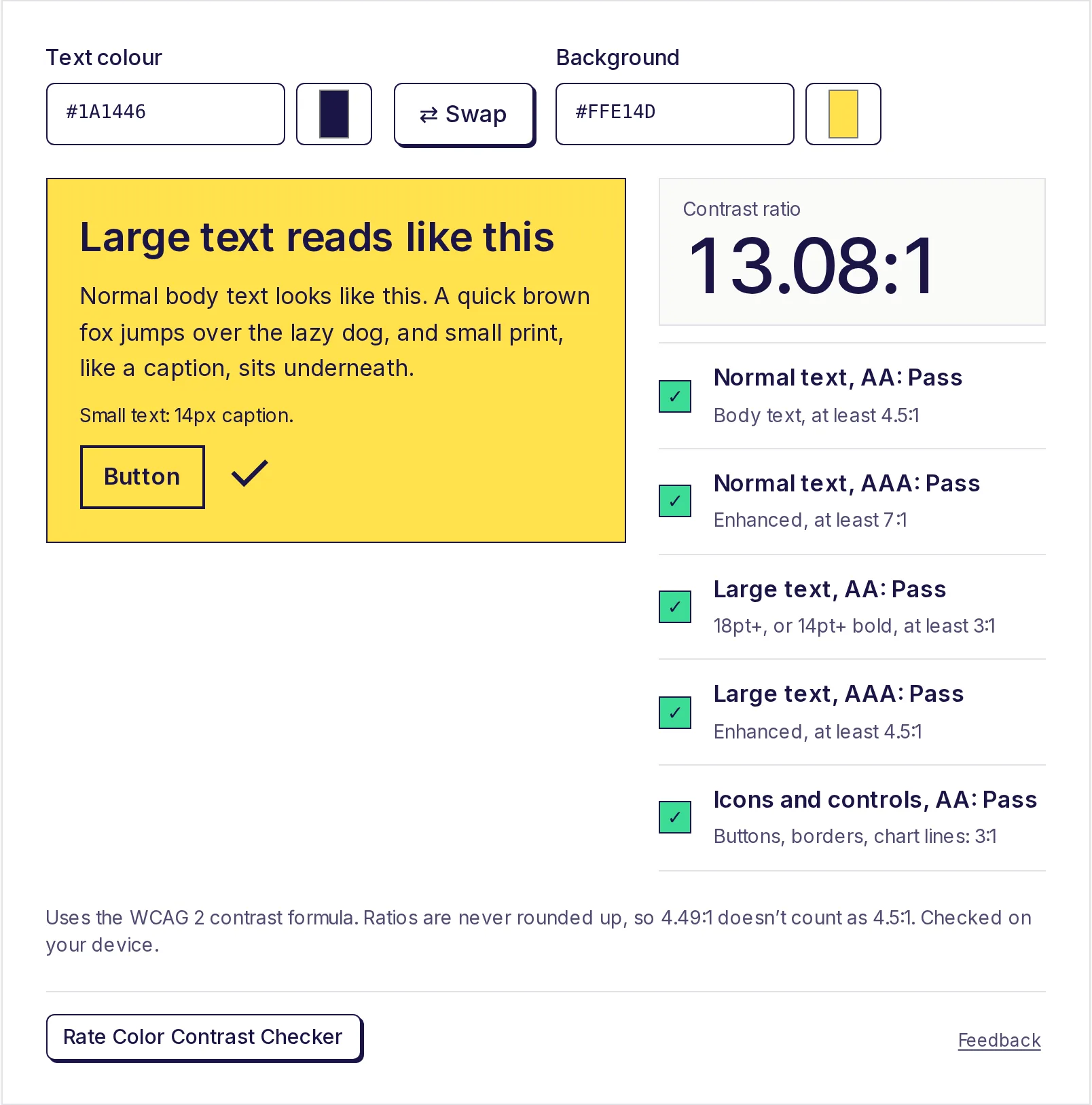
This is where many small-business palettes fail. We tested the bakery palette in the contrast checker:
| Pairing | Ratio | Result |
|---|---|---|
White text on teal #0F766E |
5.47:1 | Passes AA for all text |
Near-black text on amber #F59E0B |
8.26:1 | Passes AAA |
| White text on amber | 2.14:1 | Fails, even for large text |
| Amber text on white | 2.14:1 | Fails |
Grey #6B7280 on white |
4.83:1 | Passes AA |
Grey #6B7280 on off-white |
4.62:1 | Passes AA, only just |
| Near-black on off-white | 16.97:1 | Passes AAA |
The lesson: amber is a great button background with dark text, but never use it for text on white, and never put white text on it. Rules like this go into your brand guide (step 9). Under WCAG AA, normal text needs 4.5:1 and large text and icons 3:1; see how to check colour contrast and WCAG AA vs AAA.
When a pair fails, the checker suggests the nearest colour that passes, keeping the same hue. Click it to try it.
7. Check it in real places
Colours behave differently in context. Before deciding:
- Mock up a homepage header, a button, an Instagram post and a business card.
- View them on a phone in daylight and on a cheap laptop screen.
- Print a test page. Screen colours (RGB) often look duller in print (CMYK), especially bright blues, greens and oranges; ask your printer for a proof. See RGB vs CMYK.
- Check it in greyscale (most phones have a greyscale accessibility setting). If your primary and accent look identical in grey, people with colour vision deficiency may struggle to tell them apart.
8. Limit the palette
One primary, one accent, four neutrals is plenty for most small businesses. Add a success green and an error red for forms if you run a website. Resist adding a new colour for every campaign; seasonal posts can use your palette plus one festive colour, then go back.
9. Write it down
A one-page brand colour guide saves endless "which blue was it?" messages with designers and printers. Include:
- Each colour's name, HEX and RGB code (and CMYK from your printer).
- Its role: primary, accent, text, background.
- Do's and don'ts, like "never white text on amber".
The generator's Export gives you CSS variables, Tailwind, JSON or a HEX list for your web developer. For friendly names to go with the codes, the colour name finder suggests the nearest CSS name for each.
Our finished bakery brand colors
| Role | HEX |
|---|---|
| Primary (teal) | #0F766E |
| Accent (amber) | #F59E0B |
| Text | #111827 |
| Secondary text | #6B7280 |
| Background | #F9FAFB |
| Surface | #FFFFFF |
Build yours now
Enter your favourite candidate as the base colour in the free color palette generator, try a few harmonies, then run every pair through the free contrast checker. Both work in your browser, with no sign-up.
Frequently asked questions
- How many colours should a brand have?
- Most small businesses do well with one primary, one accent and three or four neutrals. More than that becomes hard to use consistently.
- What is the best colour for a business logo?
- There's no single best. Choose a colour that fits your personality and differs from your competitors, and make sure it works on both white and dark backgrounds.
- How do I make sure my brand colours are accessible?
- Check each text and background pair in a contrast checker. Normal text needs at least 4.5:1 and large text 3:1 under WCAG AA.
- Can I take colours from my logo or a photo?
- Yes. Upload the image to a colour picker from image to get its main colours as HEX codes, then build the rest of the palette around them.
- Why do my brand colours look different when printed?
- Screens mix light (RGB) and printers mix ink (CMYK), which can't reproduce some bright screen colours. Ask your printer for a proof and the CMYK values that match best.
Color tools
Try the Color Palette Generator
Free, no sign-up, works in your browser. Generate a five-colour palette with one press of the space bar, lock the colours you like, or build a colour scheme from your own base colour: analogous, complementary, triadic and more.
Also useful
- Color Contrast CheckerEnter a text colour and a background colour to get the WCAG contrast ratio and pass or fail results for AA and AAA, for normal text, large text and buttons or icons. If it fails, click the closest colour that passes.
- Color Palette from ImageGet the main colours of a photo, logo or screenshot as HEX codes, with how much of the image each one covers. Choose 2 to 12 colours, click the image to pick a colour from any spot, and copy the palette as HEX, CSS variables or JSON. Your image stays on your device.
- Color Name FinderPaste a HEX, RGB or HSL code, or pick a colour, and see its closest CSS colour names, nearest first, with a plain description like "dark, vivid blue". Browse and filter all 148 named colours, and copy any name straight into your CSS.