CSS Gradient Text: background-clip Method (Free Generator)
Make CSS gradient text with background-clip: text and a transparent fill. Copy a gradient from a free generator, add a solid fallback, check contrast.
Published · 5 min read
To make CSS gradient text, give the text a gradient background, clip that background to the shape of the letters with background-clip: text, and make the text colour transparent so the gradient shows through. Set a normal solid color first as a fallback. You can design the gradient itself in the free CSS gradient generator, copy its linear-gradient(...) line, and drop it into the snippet below.
The CSS gradient text snippet
.gradient-text {
  color: #2f5bff; /* fallback: a solid colour from your gradient */
  background-image: linear-gradient(90deg, #2f5bff 0%, #7b2cbf 100%);
  -webkit-background-clip: text;
  background-clip: text;
  -webkit-text-fill-color: transparent;
}
<h1 class="gradient-text">Hello, gradients</h1>
What each line does:
background-imagepaints the gradient behind the element.background-clip: textcrops that background to the outline of the glyphs. The-webkit-version is still included because some browsers have long needed the prefix.-webkit-text-fill-color: transparentmakes the letters see-through, so the clipped gradient is what you see. Unlikecolor: transparent, it leavescoloras your fallback for browsers that don't apply the effect.
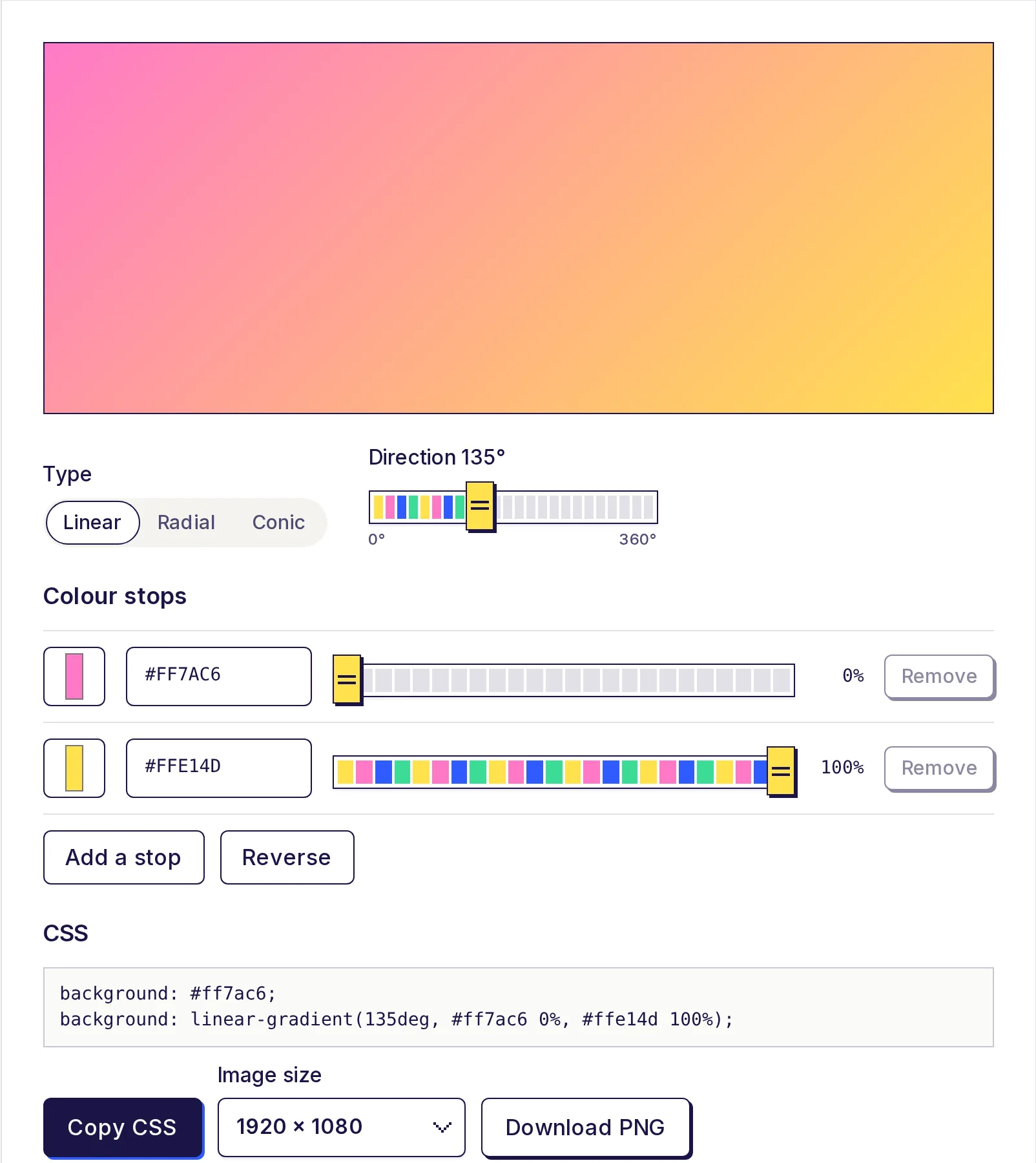
Step 1: Design the gradient
- Open the free CSS gradient generator.
- Choose Linear as the type. Linear works best for text; radial and conic gradients usually look patchy across letter shapes.
- Set the Direction slider. 90° runs left to right, which reads naturally across a heading. 135° gives a diagonal sweep.
- Pick your colours in Colour stops. Two or three stops is plenty for text; you can add up to eight.
- Look at the preview, then press Copy CSS.
Step 2: Adapt the generator's CSS for text
The generator gives you two lines, made for backgrounds:
background: #2f5bff;
background: linear-gradient(90deg, #2f5bff 0%, #7b2cbf 100%);
The first line is a solid fallback for a background. For text, don't paste that line as background: if the clip isn't applied, you'd get a solid box behind see-through letters. Instead:
- Use the first line's colour as
color: #2f5bff;. - Use the second line's gradient as
background-image. - Add the two
background-cliplines and-webkit-text-fill-color: transparent.
That gives you the snippet at the top of this page.
Step 3: Fix common layout problems
The gradient only covers part of a short heading. A block element like h1 is as wide as its container, so the gradient stretches across the whole width and a short heading shows little more than the first colour. Shrink the element to its text:
.gradient-text { display: inline-block; }
/* or */
.gradient-text { width: fit-content; }
Multi-line text looks odd. On an inline element that wraps, each line can get its own slice of the gradient. Use display: inline-block for a single gradient across all lines, or add box-decoration-break: clone (with the -webkit- prefix) if you want each line to show the full gradient.
The descenders are cut off. Letters like g and y can be clipped if the line height is very tight. Add a little padding-bottom or loosen line-height.
Emoji turn into solid gradient blobs. That's the clip working as designed. Wrap emoji in a separate span that resets the effect.
Step 4: Add a safer fallback with @supports
If you want the solid colour to be guaranteed wherever clipping isn't supported, wrap the effect:
.gradient-text { color: #2f5bff; }

@supports (background-clip: text) or (-webkit-background-clip: text) {
  .gradient-text {
    background-image: linear-gradient(90deg, #2f5bff 0%, #7b2cbf 100%);
    -webkit-background-clip: text;
    background-clip: text;
    -webkit-text-fill-color: transparent;
  }
}
Browsers that understand the clip get the gradient; anything else shows plain blue text.
Step 5: Check accessibility
Gradient text is still real text, so screen readers, search engines and copy-paste all work normally. The risk is contrast: one end of the gradient may be readable and the other not.
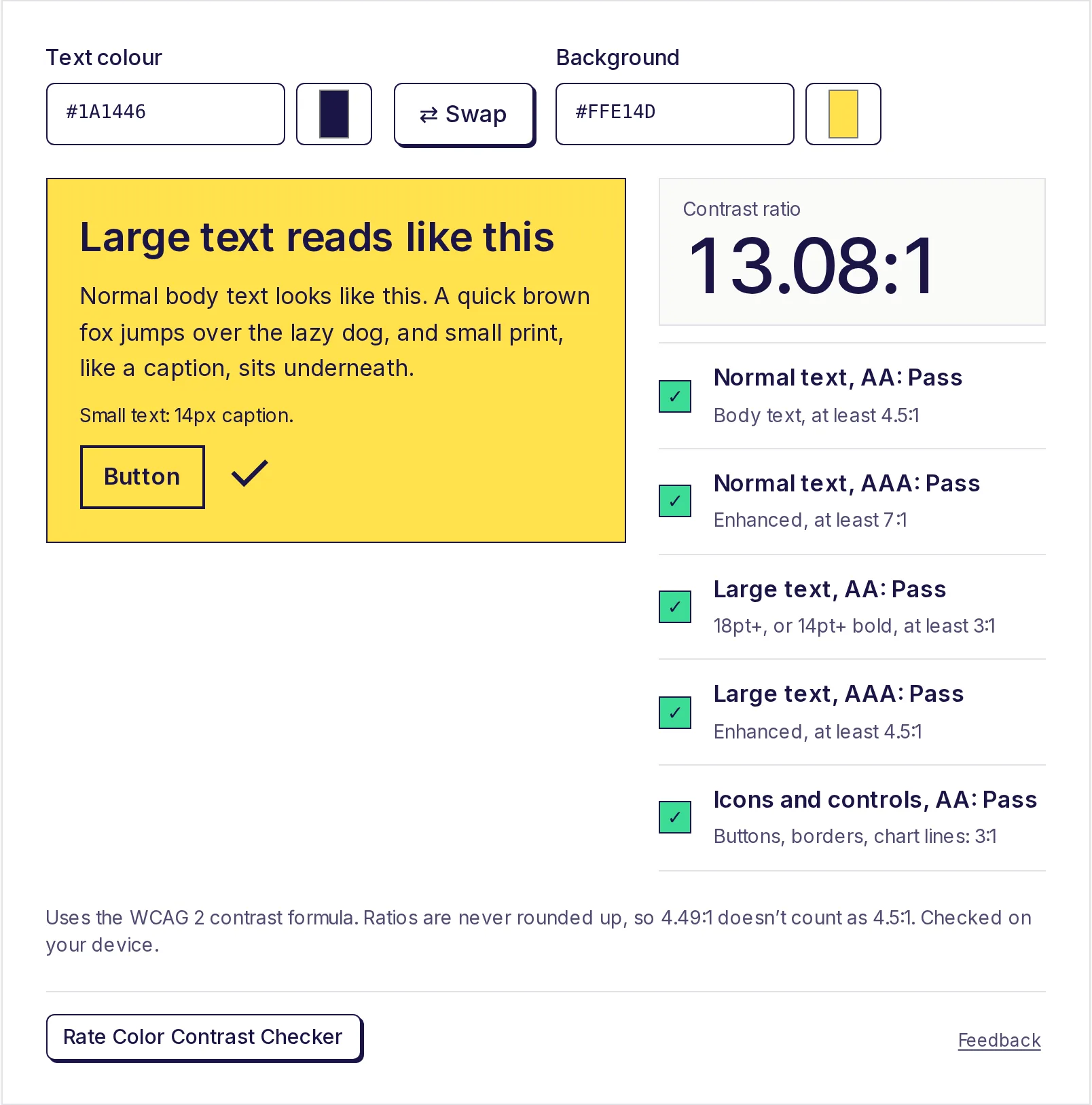
Check every colour stop against the background in the free color contrast checker. For the example above on white:
| Stop | Ratio on white | Normal text AA (4.5:1) |
|---|---|---|
#2F5BFF |
5.17:1 | Pass |
#7B2CBF |
7.10:1 | Pass |
Compare that with the generator's bright "Candy" preset (pink #FF7AC6 to yellow #FFE14D). On white, the stops measure 2.37:1 and 1.3:1, so that gradient fails as text even though it's lovely as a background. On a dark background, the same colours would pass.
More tips:
- Keep gradient text for headings and short phrases, not paragraphs.
- Don't put gradient text over a gradient or photo background; contrast becomes impossible to guarantee.
- In Windows' high contrast (forced colours) mode, the system replaces your colours; you can add
@media (forced-colors: active) { .gradient-text { -webkit-text-fill-color: currentColor; } }to be sure the text stays visible.
If you need the stop colours in another format, such as RGB for a design tool, the free HEX to RGB converter converts them. For the difference between gradient types, see linear vs radial vs conic gradients.
Make your gradient now
Design it in the free CSS gradient generator, copy the CSS, and paste the gradient line into the snippet above. The generator runs on your device with no sign-up.
Frequently asked questions
- How do I make gradient text in CSS?
- Set a gradient as
background-image, addbackground-clip: text(and the-webkit-version), and make the text fill transparent with-webkit-text-fill-color: transparent. - Why does my gradient text show a solid box?
- The background is applied but not clipped. Check that both
-webkit-background-clip: textandbackground-clip: textare present, and that you used the gradient as the background, not the solid fallback line. - Why is only one colour showing in my heading?
- The element is wider than the text, so you only see one end of the gradient. Add
display: inline-blockorwidth: fit-content. - Is gradient text accessible?
- It can be. Screen readers read it as normal text. Check each colour stop for contrast against the background, and use it for large text rather than body copy.
- Can I animate gradient text?
- Yes. Make the background larger with
background-size: 200% autoand animatebackground-position. Respect users who prefer reduced motion with aprefers-reduced-motionmedia query.
Color tools
Try the CSS Gradient Generator
Free, no sign-up, works in your browser. Design a linear, radial or conic gradient with 2 to 8 colour stops, see it live, and copy the CSS background code.
Also useful
- HEX to RGB Color ConverterConvert HEX to RGB, or RGB to HEX, as you type: paste a colour code in any format and get HEX, RGB, HSL, HSV and CMYK at once, each with a copy button. Set the opacity for 8-digit HEX and rgba(), and see how readable white or black text is on the colour.
- Color Contrast CheckerEnter a text colour and a background colour to get the WCAG contrast ratio and pass or fail results for AA and AAA, for normal text, large text and buttons or icons. If it fails, click the closest colour that passes.