Linear vs Radial vs Conic Gradient CSS (Free Generator)
Linear gradients blend along a line, radial from a centre, conic sweep around it. Syntax, examples and when to use each in CSS, with a free gradient generator.
Published · 5 min read
CSS has three gradient types. A linear gradient blends colours along a straight line, at any angle. A radial gradient spreads outwards from a centre point in a circle or ellipse. A conic gradient sweeps colours around a centre point, like the hands of a clock. Use linear for backgrounds and buttons, radial for glows and spotlights, and conic for colour wheels and pie charts. You can try all three in the free CSS gradient generator and copy the code.
At a glance
| Linear | Radial | Conic | |
|---|---|---|---|
| Colours change along | A straight line | The distance from a centre | The angle around a centre |
| Main setting | Direction (angle) | Shape (circle or ellipse), position, size | Start angle, position |
| Looks like | Sky, fades, stripes | Glow, spotlight, vignette | Colour wheel, pie chart, sunburst |
| Typical use | Page and hero backgrounds, buttons | Highlights, soft focus behind content | Charts, loaders, decorative rings |
| Function | linear-gradient() |
radial-gradient() |
conic-gradient() |
All three also come in a repeating- version (repeating-linear-gradient() and so on) that tiles the pattern, which is handy for stripes and rings.
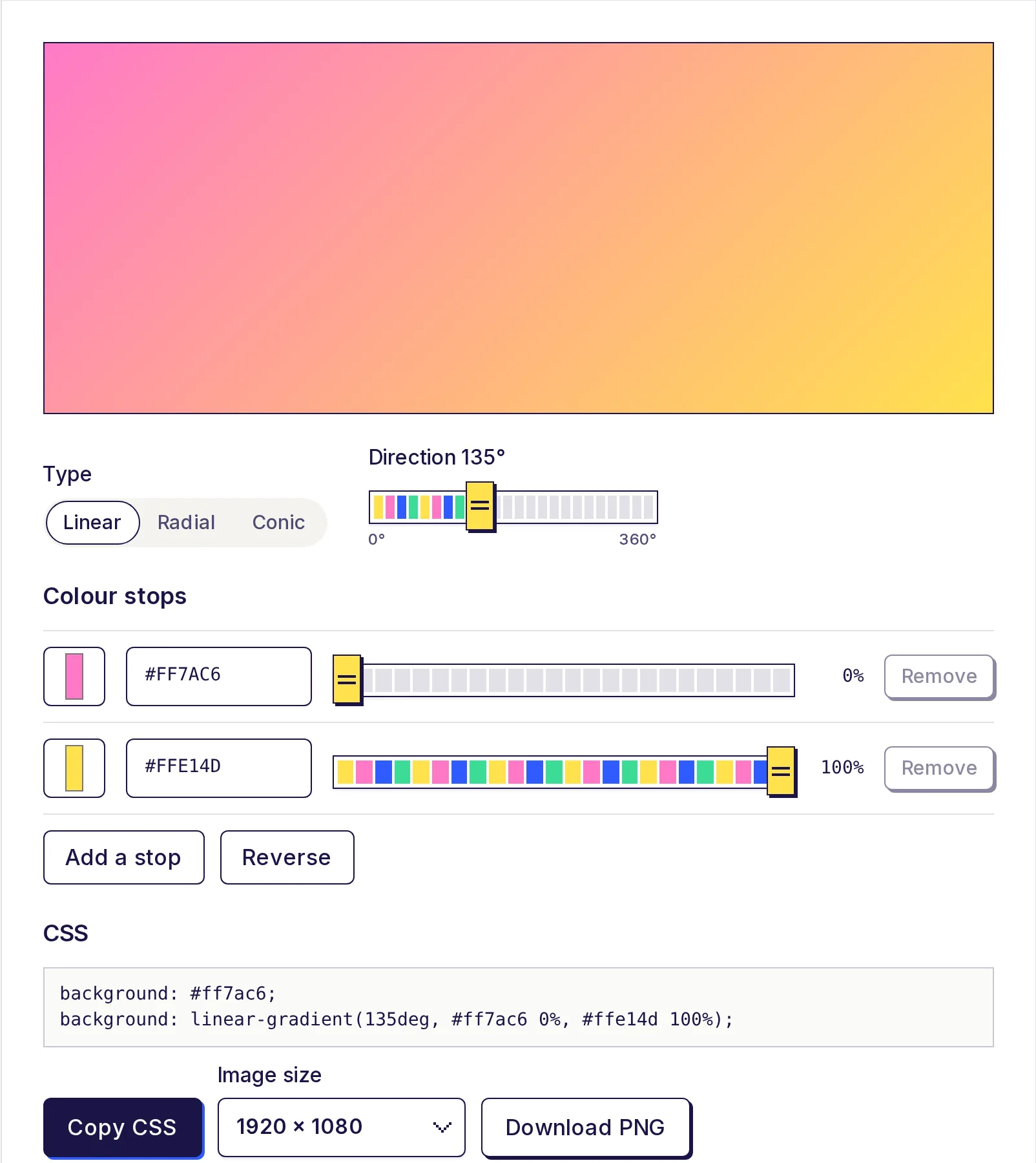
Linear gradients
background: linear-gradient(135deg, #ff7ac6 0%, #ffe14d 100%);
The first value is the direction. In CSS, 0deg points up, 90deg points right, 180deg points down. You can also write directions as words, like to right or to bottom left. Then come the colour stops, each with an optional position.
Good for:
- Full-page and hero backgrounds.
- Buttons with a subtle top-to-bottom shading.
- Fading an image into the page (gradient from transparent to the page colour).
- Hard-edged stripes, by putting two stops at the same position:
linear-gradient(90deg, #2f5bff 50%, #3ddc97 50%).
In the generator: choose Linear and drag the Direction slider from 0° to 360°.
Radial gradients
background: radial-gradient(circle, #ffe14d 0%, #ff7ac6 45%, #1a1446 100%);
A radial gradient starts at a centre point and spreads outwards. The first part says the shape (circle or ellipse) and optionally the size and position:
background: radial-gradient(ellipse at top left, #ffe14d, transparent 60%);
background: radial-gradient(circle closest-side at 30% 40%, #2f5bff, #1a1446);
Size keywords decide where the last stop lands: farthest-corner (the default), closest-side, closest-corner and farthest-side.
- Circle keeps a perfect round shape whatever the box's proportions.
- Ellipse stretches to match the box, so on a wide banner it becomes a wide oval.
Good for:
- A soft glow behind a product photo or a call to action.
- Vignettes (dark edges, light middle).
- Spotlight effects, often layered over a linear background.
In the generator: choose Radial and pick Circle or Ellipse. The generator always centres the gradient; to move it, add at top left or at 30% 40% after the shape in the copied CSS.
Conic gradients
background: conic-gradient(from 0deg, #ff7ac6 0%, #ffe14d 25%, #3ddc97 50%, #2f5bff 75%, #ff7ac6 100%);
A conic gradient goes around a point instead of away from it. from 0deg sets where the first colour starts (0deg is the top, and it turns clockwise). Stops can be percentages or angles (90deg equals 25%).
Ending on the same colour you started with, as above, makes a smooth colour wheel with no seam.
Good for:
- Colour wheels and hue pickers.
- Pie charts with no images or JavaScript, using hard stops:
background: conic-gradient(#2f5bff 0% 40%, #3ddc97 40% 75%, #ffe14d 75% 100%);
border-radius: 50%;
- Loading spinners and progress rings (combined with a mask or an inner circle).
- Starburst and sunray backgrounds with
repeating-conic-gradient().
In the generator: choose Conic and set the Start angle. The Wheel preset is a ready-made colour wheel. To make hard pie slices, drag two stops to the same position.
Which one should you use?
- Background for a whole section or page? Linear. It's predictable at any screen size.
- Something to draw the eye to the centre? Radial.
- Something round that shows proportions or hues? Conic.
- Text? Almost always linear. See CSS gradient text.
Whatever the type, check that any text on top stays readable. Gradients make contrast change across the element, so test the text colour against the lightest and darkest stops in the free color contrast checker.
Picking colours that blend well
Gradients between colours that sit close on the colour wheel (blue to purple, pink to orange) blend smoothly. Opposite colours (blue to orange) can pass through a muddy grey in the middle. Two fixes:
- Add a middle stop in a brighter in-between colour (the generator's Add a stop puts one in the widest gap, already coloured to match).
- Pick colours with the analogous harmony in the free color palette generator, which keeps hues near each other.
If you need a stop colour in RGB or HSL, or want to add transparency, the free HEX to RGB converter shows every format. The generator itself also accepts rgba() values typed into a stop.
Try all three
Open the free CSS gradient generator, switch between Linear, Radial and Conic with the same colours, and watch how the same stops behave. Copy the CSS, or download a PNG in sizes like 1920 × 1080 or 1080 × 1080. It runs on your device, with no sign-up.
Frequently asked questions
- What is the difference between linear and radial gradients?
- A linear gradient changes colour along a straight line at a set angle. A radial gradient changes colour outwards from a centre point in a circle or ellipse.
- How do I change the centre of a radial gradient?
- Add
atand a position after the shape, such asradial-gradient(circle at top left, ...)orat 30% 40%. - Do all browsers support conic gradients?
- Current versions of the major browsers support them. The generator's CSS puts a solid colour on the first line as a fallback for very old browsers.
- How do I make a pie chart with CSS?
- Use a conic gradient with hard stops, where each colour starts at the same percentage the previous one ends, and round the element with
border-radius: 50%. - Which gradient type is best for a website background?
- Linear, in most cases. It scales cleanly to any screen size. Add a soft radial glow on top if you want a focal point.
Color tools
Try the CSS Gradient Generator
Free, no sign-up, works in your browser. Design a linear, radial or conic gradient with 2 to 8 colour stops, see it live, and copy the CSS background code.
Also useful
- Color Palette GeneratorGenerate a five-colour palette with one press of the space bar, lock the colours you like, or build a colour scheme from your own base colour: analogous, complementary, triadic and more. See 11 shades of each colour and export as CSS variables, Tailwind, JSON or HEX.
- HEX to RGB Color ConverterConvert HEX to RGB, or RGB to HEX, as you type: paste a colour code in any format and get HEX, RGB, HSL, HSV and CMYK at once, each with a copy button. Set the opacity for 8-digit HEX and rgba(), and see how readable white or black text is on the colour.