WCAG AA vs AAA: Contrast Levels Compared (Free Checker)
WCAG AA needs 4.5:1 contrast for normal text; AAA needs 7:1. What each level covers, why laws point to AA, and a free color contrast checker for both.
Published · 5 min read
WCAG AA vs AAA comes down to how strict the contrast requirement is. AA asks for at least 4.5:1 for normal text and 3:1 for large text and interface parts. AAA asks for 7:1 for normal text and 4.5:1 for large text. AA is the level that accessibility laws and policies usually point to; AAA is an enhanced target, worth using for body text. Paste your colours into the free color contrast checker to see both results at once.
The three WCAG levels in one paragraph
The Web Content Accessibility Guidelines (WCAG) group their rules, called success criteria, into three levels. A is the minimum, AA includes everything in A plus more, and AAA is the strictest. Contrast appears at two levels: "Contrast (Minimum)" is an AA rule, and "Contrast (Enhanced)" is the AAA version of the same idea. A separate AA rule, "Non-text Contrast", covers icons and controls.
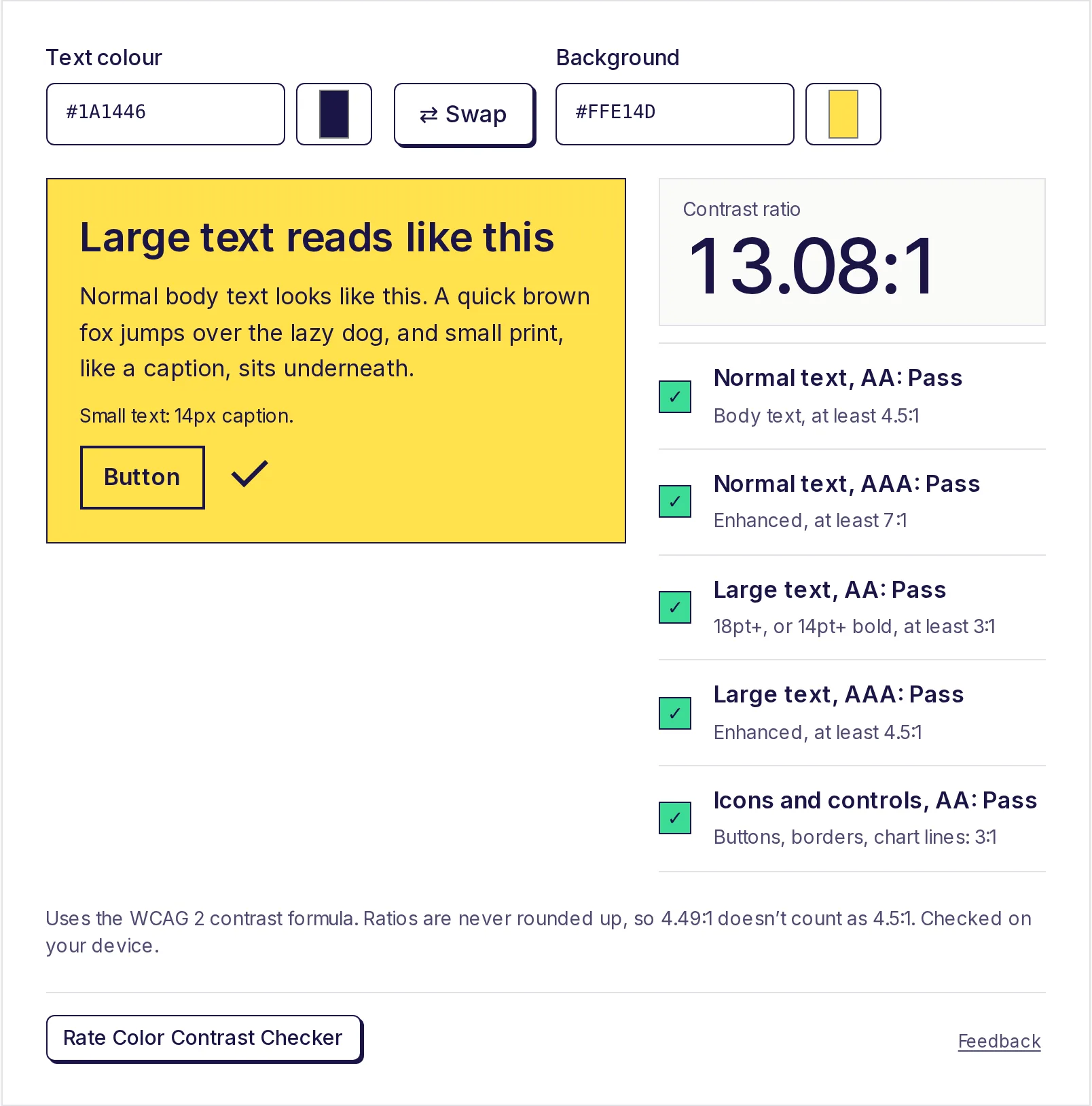
Contrast requirements side by side
| What you're checking | AA | AAA |
|---|---|---|
| Normal text | 4.5:1 | 7:1 |
| Large text (24 px regular, or about 18.7 px bold, and up) | 3:1 | 4.5:1 |
| Icons, buttons, input borders, focus outlines, chart lines | 3:1 | No higher level |
| Logos and purely decorative elements | Exempt | Exempt |
Two details matter in practice:
- Non-text contrast is AA only. There's no stricter AAA number for icons and controls, so 3:1 is the target at both levels.
- AAA for large text equals AA for normal text (4.5:1). If your whole design passes AA for body text, your large headings automatically meet AAA too.
How to read the ratio itself, and the quirks of the formula, are covered in how to check colour contrast for accessibility. This page is about choosing between the levels.
What changes when you go from AA to AAA
Here's what the jump looks like with real colours on a white background, as the checker reports them:
| Text colour | Ratio on white | AA normal | AAA normal |
|---|---|---|---|
#767676 grey |
4.54:1 | Pass | Fail |
#595959 grey |
7:1 | Pass | Pass |
#2F5BFF bright blue |
5.17:1 | Pass | Fail |
#0037FF deeper blue |
7.02:1 | Pass | Pass |
#E4007C magenta |
4.57:1 | Pass | Fail |
#AD005F darker magenta |
7.13:1 | Pass | Pass |
The pattern: AAA usually means a noticeably darker shade of the same hue. Mid greys, which many designs use for secondary text, are the first to fail. The checker's Closest colours that pass section finds these darker versions for you: it shows a swatch for AAA whenever the ratio is under 7:1, and a second one for AA when it is also under 4.5:1.
What laws and policies reference
Most accessibility laws and public-sector standards point to WCAG level AA, not AAA. Some examples (always check the current official text, since dates and versions change):
- United States, state and local government: the Department of Justice's 2024 rule under ADA Title II adopts WCAG 2.1 AA. As per DOJ's interim final rule of April 2026, the compliance dates were pushed back by a year, to April 2027 for entities serving 50,000 people or more and April 2028 for smaller ones.
- United States, federal agencies: the Section 508 standards incorporate WCAG 2.0 AA.
- European Union: the European Accessibility Act has applied to many products and services since June 2025. Its harmonised standard, EN 301 549, uses WCAG 2.1 AA for web content.
- India: the Guidelines for Indian Government Websites (GIGW 3.0) aim for conformance with WCAG 2.1 level AA, as per the official guidelines portal, checked in 2026.
WCAG itself says it isn't recommended to require AAA as a general policy for entire sites, because some content simply can't meet every AAA criterion. That's why policies stop at AA.
This isn't legal advice. If you work for a regulated organisation, ask which version and level your contract or regulator specifies.
When AAA is worth aiming for
Even without a legal requirement, AAA contrast helps in specific places:
- Long-form reading: articles, documentation, terms and conditions. More contrast is less tiring over many paragraphs.
- Audiences with low vision or older readers: health services, pension portals, government forms.
- Bright or poor screens: apps used outdoors, on cheap phones, or projected in meeting rooms. (See colour contrast tips for presentations.)
- Small text you can't make bigger: captions, footnotes and table cells.
When AA is the sensible target
- Brand colours on buttons and links. A vivid brand blue often passes AA but not AAA. Darkening it to 7:1 can change the brand, so many teams keep AA there and use AAA for body text.
- Large headings. At 3:1 for AA they give you more colour freedom, and AAA large text is only 4.5:1.
- Dark mode. Hitting 7:1 with coloured text on dark backgrounds pushes accents towards pastel. Dark mode colour tips covers this balance.
A practical rule many design systems follow: body text AAA where possible, everything else at least AA, and no exceptions below AA.
Check a whole palette
- Build or paste your palette into the free color palette generator and copy each HEX code.
- In the free color contrast checker, test each text colour against each background you plan to use.
- Note which pairs pass Normal text, AAA, which pass only Normal text, AA, and which are Large text only.
- Use the shade scale in the palette generator (50 to 950) to pick a darker step when a pair falls short.
Check your colours now
Paste your text and background colours into the free color contrast checker and see AA and AAA results side by side, with passing shades suggested. It runs on your device, with no sign-up.
Frequently asked questions
- Is WCAG AAA required by law?
- Generally no. The laws and standards we know of point to WCAG AA. AAA is an optional, enhanced level, though a contract or organisation can choose to require it.
- What contrast ratio is AAA?
- 7:1 for normal text and 4.5:1 for large text. There's no separate AAA level for icons and controls; they stay at 3:1.
- Does AA for large text equal AAA?
- No. AA large text needs 3:1. AAA large text needs 4.5:1, the same as AA normal text.
- Is 4.5:1 enough for accessibility?
- It meets WCAG AA for normal text, which is the usual legal and policy target. For long reading or low-vision audiences, aiming for 7:1 is better.
- Does WCAG 2.2 change the contrast ratios?
- No. WCAG 2.2 adds new success criteria, mainly around focus and input, but the 4.5:1, 7:1 and 3:1 contrast thresholds are the same as in 2.1.
Color tools
Try the Color Contrast Checker
Free, no sign-up, works in your browser. Enter a text colour and a background colour to get the WCAG contrast ratio and pass or fail results for AA and AAA, for normal text, large text and buttons or icons.
Also useful
- Color Palette GeneratorGenerate a five-colour palette with one press of the space bar, lock the colours you like, or build a colour scheme from your own base colour: analogous, complementary, triadic and more. See 11 shades of each colour and export as CSS variables, Tailwind, JSON or HEX.
- HEX to RGB Color ConverterConvert HEX to RGB, or RGB to HEX, as you type: paste a colour code in any format and get HEX, RGB, HSL, HSV and CMYK at once, each with a copy button. Set the opacity for 8-digit HEX and rgba(), and see how readable white or black text is on the colour.